The Highlighter Mobile App
A mobile solution to help connect school teachers who need classroom supplies with donors who are will to make one-time donations or sponsor a class for a specified period of time.
Role Product Designer, April 2019
Background
The Highlighter was a student passion project that is really special to me because I have so many friends who are school teachers. A frequent source of frustration they speak about are classroom supplies. According to the U.S. Department of Education, 94% of teachers spend their own money for classroom supplies—an average of $479 per year. At schools with 74% or more students eligible for free/reduced price lunch, teachers spend an average of $1000 per year.
My research, composed of some competitive analysis, teacher interviews (27 teachers) and user surveys (30 participants), helped me generate 2 main personas (the donor and the teacher) and four key features for the app:
User’s ability to find the nearest classrooms-in-need based on location;
87% interviewees expressed the desire to help teachers within their community
Personalize the need with posts about the teacher and the students;
88% of interviewees expressed that it would be nice to know exactly what their donation money was going towards
98% interviewees said they were not aware that teachers were using their own money for school supplies
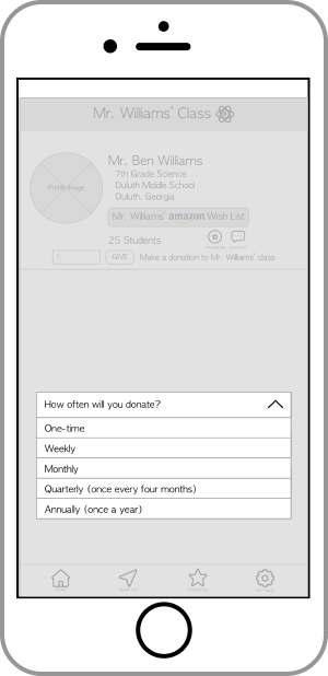
Option for one-time or periodic donations (sponsorship); and
35% interviewees said that they already make periodic donations to a charity
33% interviewees said that they would sponsor a teacher for a specified period of time (most said a period of 1 year) if the option was given to them
100% interviewees said that it was highly probable they would make a donation to help a teacher again
80% of interviewees said that they made a donation because they were asked
Quick checkout process.
100% interviewees said the checkout process would be a determinative factor in becoming a repeat donor
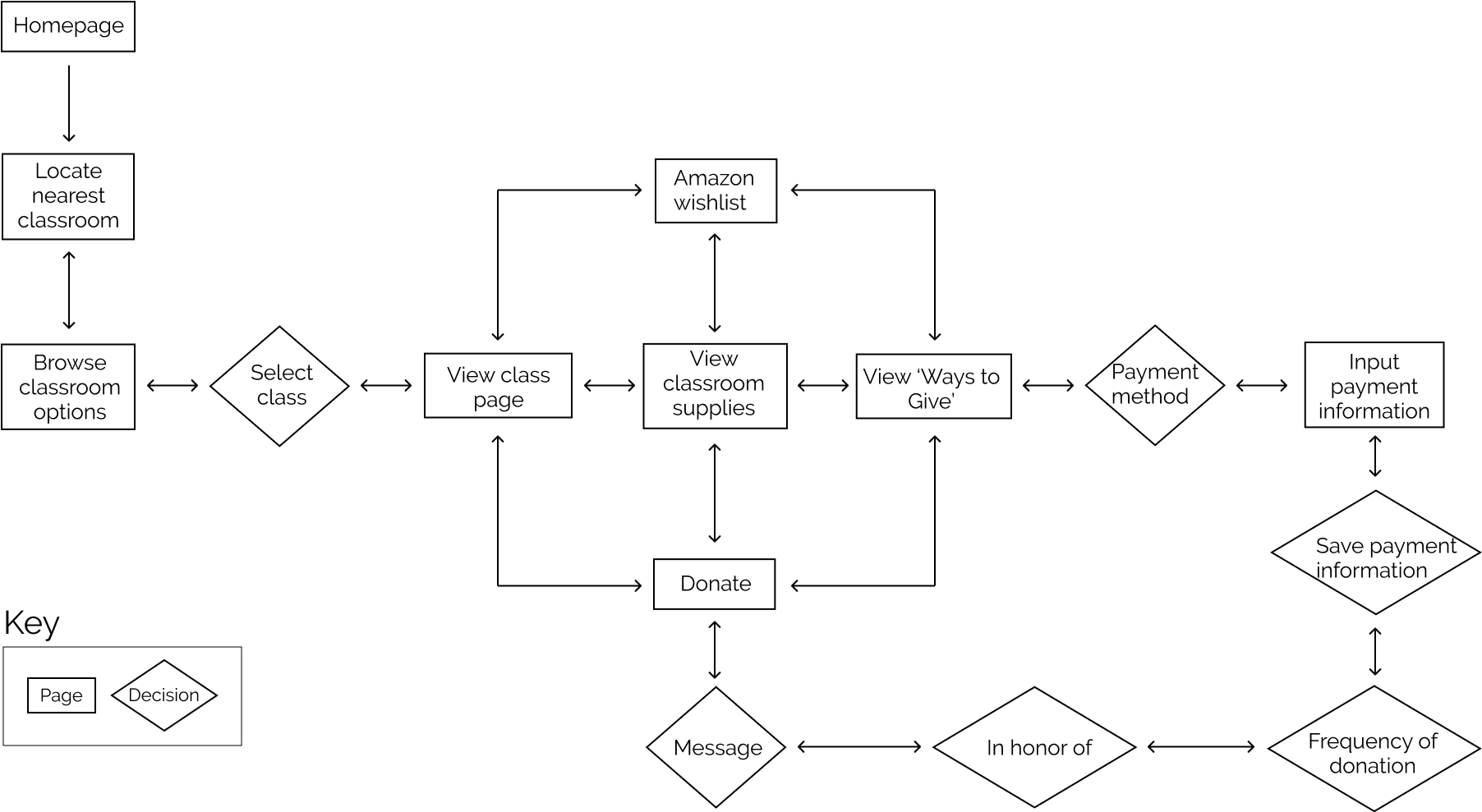
A user flow was generated based off the research and key features:
Ideate, Develop & Test
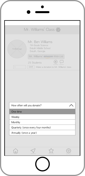
I started out with paper wireframes before building out digital wireframes that were eventually used for testing with 15 individuals. Each participant was asked to complete a series of tasks and were asked follow-up questions about their experience after the test.
Iterate
Testing confirmed most of the features I originally started out with:
User’s ability to find the nearest classrooms-in-need based on location;
Personalize the need with posts about the teacher and the students;
Option for one-time or periodic donations (sponsorship); and
Quick checkout process.
Feature #2 was removed as a feature because many of the users were concerned with posting too much details about the students, thus posing a risk to student safety. Most of the users explained that knowing what the donor’s money was being used for would be sufficient enough to personalize their donation.
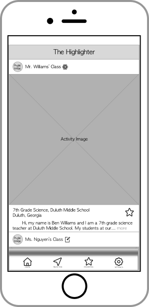
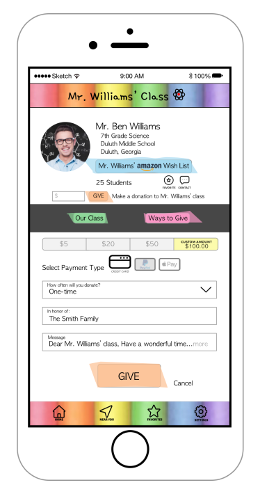
I took the results from user testing to make changes to the wireframes and built mockups.
Results & Takeaways
Working on this project gave me a few takeaways:
Most people want to help. They just need to be given the opportunity!
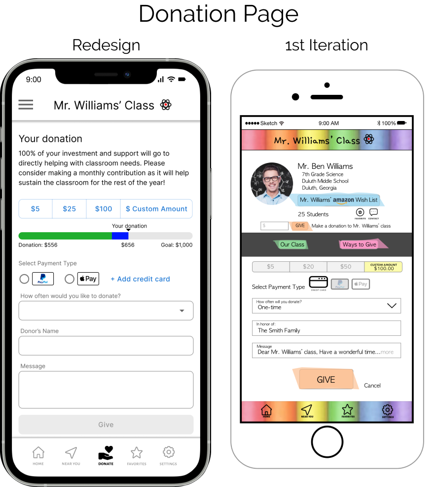
The experience needs to be simple and easy. People are more likely to become repeat donors if the giving-experience itself is a smooth transaction.
Keep it small. People are less likely to return as a donor if they are asked to give large amounts. Keep the amount small, it’s easier to donate $1 than $20!
Be transparent about where the money is going. People like to know details about what their money is doing to help! For example, let the donors know their $5 donation = 2 crayon boxes. Or, create a wishlist and allow donors to purchase the items themselves!
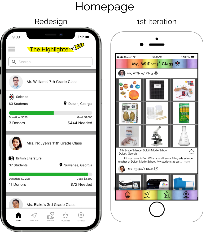
I worked on this project as a student many years ago, and I thought it would be fun to go back and iterate on my design as a student. One of the biggest things I’ve learned as a designer is to continue to review past work and never stop learning, amazing revelations can come from it as well as helping you see how far you’ve come!


