NCR Voyix Analytics
Interventions Dashboard for Self-Checkout
Background
NCR Analytics is the reporting tool in retail for store operations, self-checkout and loyalty. I worked in collaboration with multiple disciplines on defining best in class journeys and presentations of metrics and data (data visualization) that are digestible and offer actionable insights to its users.
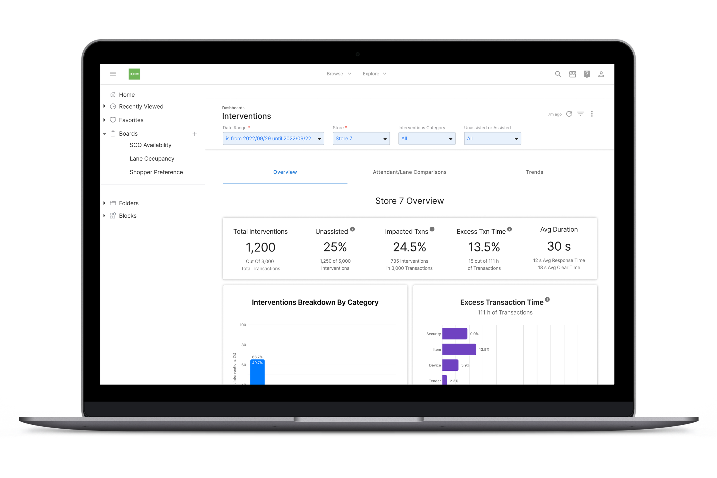
The Interventions Dashboard gives the user insights into the different types of interventions that requires action by a staff member in order for the shopper to move on with the checkout process. These insights can be helpful in loss prevention, shrink, improving customer experience, identification of issues to improve sales and help solve labor or staffing issues.
Role Product Designer, May - July 2022
Identifying the Business Needs
There have been times when I’m brought onto a project and I’m given no product requirements, no epics, and no user stories. Sometimes, you just really have to listen to your stakeholders, take copious notes, and through multiple iterations of your low fidelity wireframes, finally figure out what you’re building. It can be an arduous process, but it’s an opportunity to become more involved during the “concept” phase of a product, and really see how a product evolves from concept to implementation.
Research: User Interviews
One of the issues with jumping straight into building a product without conducting adequate user research is that you might make a lot of assumptions that may not be true, and in the words of one of my favorite television characters, “Assumptions kill” (Jack Reacher).
I love any opportunity to conduct user interviews, but when we have a short window for delivery, then internal interviews are often just as helpful. Interviews can be quite a powerful tool in discovering new opportunities for a product or generating ideas that you might not have otherwise thought about on your own. Maybe it’s the lawyer in me, but you can never ask enough questions and there is no such thing as a dumb question, just a clarifying one!
I worked with two other designers (one data visualizations designer and one self-checkout designer) to come up with a project plan that included user interviews.
We enlisted the help of our UX researchers to help us come up with an interview plan and script. The usability tests were conducted over a two week period with 9 participants (a mix of existing customers and internal stakeholders) and after they were complete, we had a working session where we created an affinity map in order to see any emerging patterns.
Here are the interventions insights that our customers want the dashboard to help them with:
Loss prevention
Help in identifying problems to improve sales
Labor/staffing
Improved customer experience
Identifying the source of the intervention
Anything to help control shrink
Defining the MVP
Based on the interviews, we were able to identify the following key user stories:
See a high level interventions overview. Users can view data quickly and get quick insights before deciding to drill down in the details.
See how long an intervention takes to resolve. Users can view the duration of these interventions in order to make decisions on labor/staffing, identify any areas of improvement, and/or see areas where customer experience can be improved.
Identify the source of the intervention. Users can see who or what is causing the intervention in order to see which interventions need the most attention, and gain insight into improving or preventing interventions.
View impact over time. Users can see progress over time and see the measurable impact of interventions in their store.
Benchmarking. Users can see how their store’s performance in comparison to their competitors and find opportunities for improvement and refine any processes or procedures to their benefit.
Design
We went through multiple iterations of the design because there were often disagreements between the product team and designers over functionality and usability, but we were able to land on a happy medium.
Interventions Overview
This gives users the ability to view a quick summary of the total number of interventions, the impacted transactions and average duration of each intervention.
Data Visualizations
Rather than looking at data in tables, users can look at the data in the form of charts to get a quicker understanding of the impact of the interventions to the store.
Benchmarking
Users can see how their store performs against other stores in their region or chain.
View Interventions by Cashier or Lane
Users can view who or what is causing an intervention.
Results & Takeaways
As with all of my projects, I’m always going to think about how we can do better for a future iteration. No product is ever truly “done” growing and improving.
Just because something is functional, doesn’t mean it’s usable. In other words, just because it works, doesn’t mean anyone is going to use it. The products that figure this out will find success with their users, and the products that don’t will have frustrated ones.
Just because it’s usable, doesn’t mean it’s sustainable. This project was definitely one where I had to constantly explain why research, quick testing and iterations were necessary in order to build—not just a usable product—but a sustainable one. You don’t just want to build a great product, but you want to build one that will last for years, and also expand as your customer base or customer needs grow.
Don’t be afraid to stand up for your designs. Notice I didn’t say defend. When you get defensive, others will too and any design feedback you receive should be helpful to your design process and provide you with a better understanding for what your stakeholders and users are looking for.


